Tuesday, 27 August 2013

Motion Capture, Part 2: Importing to Motion Builder


Before I even attempted to paint the weights on my character, I wanted to see if I could import it into Motion Builder and get it set up. Although, there weren’t many internet tutorials that I found helpful but I managed to figure out what needed to be done to import a file into the program.

In order for Motion Builder to correctly work out the joints in the arms, the model would need to be in a perfect t-pose. So, I went back and altered the model to fit it into a t-pose, redoing the skeleton also. It's also extremely helpful to name all the joints of the skeleton for the setup process.


Before it can be imported, the Maya file need to be exported as an FBX file. The file needed to included the mesh and bound rig, and have the textures displaying before export for them to show up in Motion Builder.

Unfortunately, on my first real attempt, the arms of the skeleton kept showing up as orange on the display in the Character Controls window, meaning that something wasn’t lining up properly. I had to tweak the skeleton in the arms until it showed up correctly.

With model altered, I then properly imported it into Motion Builder correctly and made sure it was ready to use.

To make it easier to find the files, right click in the bottom right, where it shows Characters, and "Add Favourite Path.".

Select the folder that contains the FBX and click OK.

The files should show in the bottom right. Click and drag the file onto the grid and click <No Animation> to import.

After importing the file, drag the "character" icon from the bottom right to the grid, this should open the Character Settings and Character Definition boxes in the bottom left.

Click on Character Definition, find the joints in the menu on the far left and drag them to the appropriate label in the Mapping List. So, for example, I dragged the bone labelled "hip" to the "hips" label. Now Motion Builder recognises that bone as the hips because the hips are green on the silhouette beneath Character Controls.

Do this for all the joints in the legs...

...And upper body. When the skeleton is green, the joints have been mapped correctly.

To finalise the skeleton, click the Characterise tick box under Character Definition. In the small character window that comes up, click Biped, as the character walks on two legs.

Once the rig has been characterised as a biped, click Create under Control Rig in the Character Definition menu.

Set the Control Rig to FK/IK.

Now the rig is ready for animating!

Now that I know how to import a model into Motion Builder and that it will work properly with the rig, all I need to do is learn how to properly paint the weights of the model.

Tuesday, 30 July 2013

Motion Capture, Part 1: Learning to Rig


Early in July, the opportunity arose to try out motion capture, or mo-cap,  within the university, sort of a joint project with the drama department. Motion capture is, basically, recording the movements of real actors and using those to animate a 3D character without the need for hand animation. It was a fantastic opportunity to get a character animated without much knowledge in animating a 3D model.

Not to mention the stylish mo-cap suits.
Beyond: Two Souls by Quantic Dream and Sony Computer Entertainment.
Image source: http://farm9.staticflickr.com/8086/8516491143_0eb89d82b4_o.png
Last accessed: 7th December 2013

After the first meeting, it was established that, in order for the process to begin, I would need a rigged and weighted 3D character ready to import into a program called Motion Builder by Autodesk. It quickly dawned on me that I knew very little about rigging 3D characters, almost nothing about weighting characters and less than that about using Motion Builder.

So, my first objective was to teach myself a little bit about how to properly rig a character I’d already modelled, with the help of a few internet tutorials.

I then set about creating a rig for my monkey character.

I created the rig by going to Skeleton > Joint Tool and started with the base of the spine.

I created one half of the rig from the root at the skeleton.

I mirrored the arm and leg joints.


With the rig complete, I combined it to the mesh by selecting both and going to Skin > Bind Skin > Smooth Bind.

With the model rigged, my next objective is to see how difficult it will be to import a rigged mesh into Motion Builder because this program is also completely new to me and I have no idea how long or labourious the process will be.

Tuesday, 25 June 2013

Stylised Noir


Going into June, I set about redesigning a couple of characters from my third year project. I took the main character and tried to design the character to fit into the similar sort of "stylised realism" that both BioShock Infinite and Dishonored have.


After doing these initial sketches, however, I found myself unhappy with the outcomes. I found it difficult to strike a good looking balance between looking slightly cartoon-ish and looking realistic. Outside of life drawing, trying to make something, that isn't real, look realistic is quite challenging. That's why I've always preferred doing something completely stylised because, as long as the world and the other characters maintain the same visual aesthetics, I can push body shapes, features and movement without worrying whether it's real or not.

I ended up going back to the initial designs that I did in third year and, instead of taking a more realistic approach, I looked at some artists that have done work in animation and comics as inspiration for my next set of sketches. Specifically, Bruce Timm and Mike Mignola.

Batman by Bruce Timm.
Image source: http://24.media.tumblr.com/d08cc57c9c8144bb9b7173d6e5e9aabf/tumblr_mvsrr7iVI41sl3wgio1_1280.jpg
Last accessed: 5th December 2013


Hellboy by Mike Mignola.
Image source: http://tri-stateoriginalart.com/wp-content/uploads/2010/11/mignola-hellboy-1998.jpg
Last accessed: 5th December 2013

Having looked at the work of Bruce Timm and Mike Mignola, I decided to use their stylised work as inspiration and set about redesigning that initial detective character again.


In addition to redesigning the main detective character, I fancied having a go at redesigning one of the third year project's female bosses, both human and demon form.


After designing these two characters, I decided that, if I were to model one, I'd go for the lust demon because the silhouetted form and the glowing parts would look interesting with all that lighting painted directly onto the texture.

I think that, if I were to use glow maps to replicate some details often found in comics, like eyes and highlighted objects being clearly visible in complete darkness. It is possible to replicate comic book composition and lighting this way as there are examples of this technique being used, such as the example shown in this link, but I have yet to test it out myself.

Also, while researching this technique of using glow maps to replicate comic book aesthetics in 3D, I stumbled across this fantastic test animation from "Super Rune" with replicate's Mike Mignola's art style almost perfectly in 3D:


Sunday, 12 May 2013

"Style is knowing who you are, what you want to say, and not giving a damn." -Gore Vidal

For the past couple of months, I've been trying to find something I've wanted to work with throughout my MA. I've struggled to come up with ideas that I liked and enjoyed. I've chosen to create and design 3D characters and present them as 3D printed figurines, but I've yet decide on what type of characters I'd like to design or focus on. In the wake of my most recent contextual studies essay, I've decided to focus on styles (but that doesn't mean I'm going to exclude realism entirely) when it comes to designing my characters. I've pretty much just spent this entire practise looking into what styles and what types of characters I'd like to experiment with.

The next big step is to pick a bunch of those styles and play around with them properly, design a character, or series of characters, and translate those characters into 3D while maintaining their style.

When it came to picking what styles and genres I'd like to mess around with, I wanted to pick stuff that would be fun to do, and maybe stuff that hasn't been seen that often in games, or push myself and try one or two styles outside of my comfort zone.

For the first set of characters I'm going to work on, I took a look back at some of the work I did during my third year. I liked the ideas and characters I had for a GDD (game design document) I wrote during my third year about a supernatural detective in the 1940s, it was . The style was very much based on film noir comic strips, Sin City, to be specific. I'd like to take that, redesign it, and translate it into 3D.

The Devil of my Colt .45, a noir supernatural detective game I pitched in my third year.

Sin City (1991) created by Frank MILLER

I liked the heavy use of lighting and two tone black and white, using minimal colour to make it stand out. However, only one game comes to mind that specifically using this two-tone comic book method, MadWorld.

MadWorld (2009) directed by Shigenori NISHIKAWA

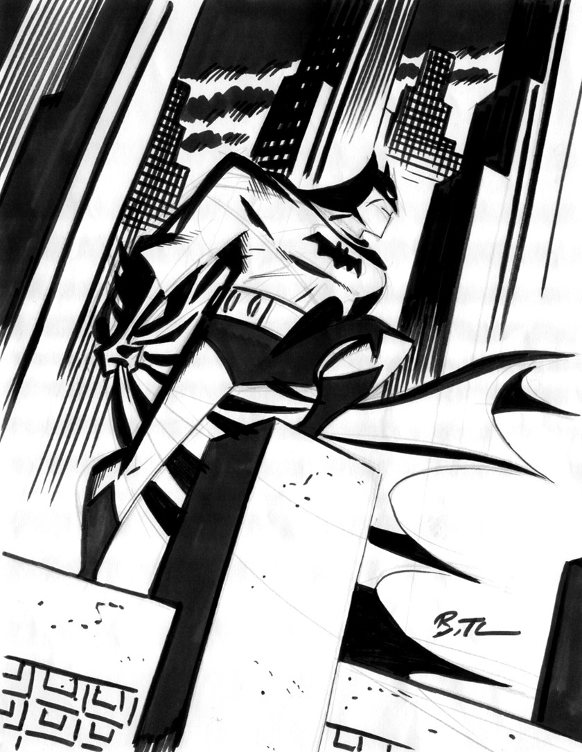
Having the two tone colour is great for creating painted lighting on a static piece, like this Batman: Black and White statue done by Mike Mignola:

Batman: Black and White statue designed by Mike Mignola.

I thought about doing two sets of textures for these noir characters. One set of two tone figures, used exclusively for the printed models, and another would be models designed for "in game" use. For these "in game" models, I had the idea of making their textures look like the Sin City movie adaptation done by Robert Rodriguez. In was basically a black and white film but added spots of colour for important characters. It also used some cool cinema techniques to emulate certain comic book effects, like Marv's white plasters being completely visible in darkness. This is a common thing in comic books where the whites of a character's eyes, their teeth, or blood is perfectly visible even in darkness. In theory, this can be achieved experimenting with glow maps.

Sin City (2005) directed by Robert RODRIGUEZ

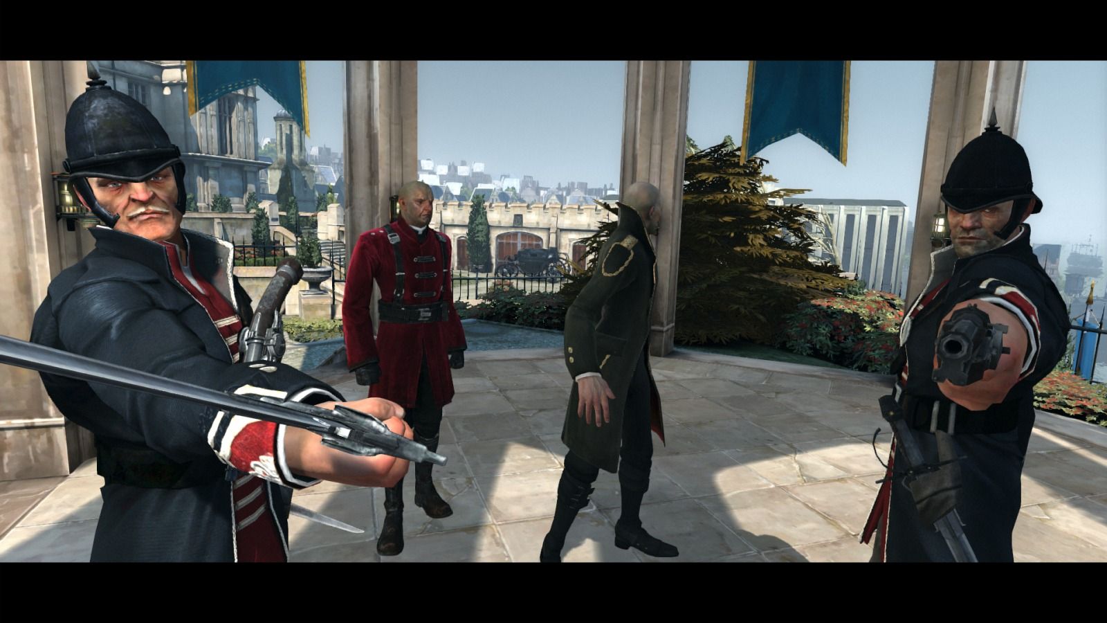
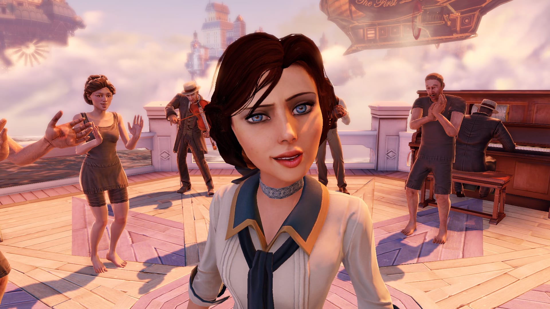
Still looking into revamping this noir GDD from third year, I had a look at visual styles. The games Dishonored and BioShock: Infinite caught my eye. Both of these games use distinctly human characters, with realistic textures, but they don't look quite realistic. Their human characters are stylised, almost caricatured or cartoony.

Dishonored (2012) developed by Arkane Studios

BioShock: Infinite (2013) developed by Irrational Games

For revamping this noir style game, I'd like to combine the caricatured style of Dishonored and BioShock: Infinite with the artistic style of the Sin City film to create characters for a visually distinctive set of characters. In addition to learning how to properly rig, learning how to use Mudbox and making my first 3D prototype, this is what I will be working on over the next few months.

Mid-Core Gaming and Character Driven Narrative

While researching my second contextual studies essay, I checked out some of the DICE 2013 video presentations that talked about an apparent new market in the games industry: mid-core gamers. The DICE 2013 presentation talked about a few topics that I found interesting:

> The call for more story in video games to be written by writers from the creator of Heavy Rain;
David Cage's DICE 2013 Keynote "The Peter Pan Syndrome: The Industry that Refused To Grow Up"

> Choice in video games from the creator of Borderlands;
Randy Pitchford's DICE 2013 Keynote "Video Games Are Magic"

> The mid-core idea, and games about human interaction not player empowerment from Epic Mickey's Warren Spector;
Warren Spector's DICE 2013 Keynote "Hey, You Kids! Get Outta My Yard! or The Graying of Gaming"

> The future of RPGs from Ray Muzyka;
Ray Muzyka's DICE 2013 Keynote "A Conversation About The Future of The RPG Genre"

> A look at episodic gaming and character driven narrative from the creator of The Walking Dead game;
Dan Connors' DICE 2013 "Episodic Gaming: How Telltale's Episodic Model Is Changing The Way People Play"

The overall point of these DICE 2013 presentations is to put focus on making engaging story telling in games with interactive narratives and choice. They talk about games that focus on telling interactive stories based around things that affect people, and based around how people interact on more realistic level. How peoples' actions and choices are reflected on by NPCs and having player actions determine narrative. These multiple choices add to a game's re-playability.

It forms the basis for this idea of "mid-core gaming." Games that focus on story telling and character interaction that is easy to pick up and play for the casual gamer and allow them to enjoy the experience, but have a depth that hardcore gamers can get into. A game that can be comfortably played and completed within a short period of time, but provides additional rewards for players who seek out additional content within the game.

Personally, I love the idea of character interaction within games, making choices, and seeing how my choices affect the narrative. That's not to say I don't enjoy the more fantastical aspects of gaming. I love having a deep game full of interesting characters and choices, but I don't think these elements should be limited to "mature" games. I think having character interaction in games is perfectly possible in games aimed for children, providing those characters are interesting and engaging enough.

Since the DICE keynotes, other opinions of the idea of "mid-core" have cropped up. Kevin Glimer's article on Gamasutra makes an interesting counterpoint. He basically goes on to say that the idea of casual, mid-core and hardcore is flawed, and that people jump back and forth between these demographics within a single day. That the type of game a person plays depends as much on location and time restraints as personal preference.

Having looked into this idea of character driven narrative and character interaction forming the basis of this idea of mid-core gaming, as I design characters, I should look into character interaction. Overall, I thought these were interesting points to look into.

The Uncanny Valley

While doing some research for my contextual studies essay, I had a look into how aesthetic can affect immersion in game and stumbled across this video:

The uncanny valley is the idea that if you give clearly non-human characters human characteristics, they're seen as charming or endearing. However, if it is given too many human characteristics, it is seen as a twisted copy of a human being that is unsettling or ugly. This unsettling version of a non-human trying to appear human, is the uncanny valley. Clearly non-human characters with human characteristics make those human qualities stand out whereas simulating an imperfect human makes their non-human characteristics stand out.

The two sides of the valley are style and photo-realism. Unfortunately, in games, we've yet to achieve true photo-realism and this makes the flaws much more glaring. Having stylised games opens the game up to more artistic variety but still has some pitfalls. The video explains it much better.

How might this affect my MA? I much prefer exploring styles in games but that's not to say I don't like photo-realistic games. I find it much more fun and appealing exploring styles and themes artistically. After coming to the conclusion that aesthetics alone don't affect immersion in games, I think it'd be beneficial for me to focus on style exploration.

Translating Style Between 2D and 3D (Work from March 2013)

In February, I decided to look at what my inspirations were, as well as decided what the ultimate goal for my MA would be. Having decided what I'd like to do, for now, I took a couple of characters I had designed in my spare time during the first semester and decided to model them. Starting in March, I began to model a couple of the characters, starting with the monkey.

Initial Concept
Turnaround


Body renders
Head renders
Basic body texture
Basic head texture
Basic eye texture

After creating a low poly mesh for this character, UV mapping, and applying a very basic texture, it was at this stage that I began looking into turning this character into a printable 3D figure. I began editing this model above, making sure it had no holes in the mesh. I also began to look into properly rigging this character for posing, and taking it into Mudbox to increase it's poly count and make the model smoother without affecting the desired silhouette. Unfortunately, I've yet to finish adjusting this model for print as I got distracted by writing the contextual studies essay.

The next thing I'm going to do with this model is continue making those adjustments, rigging and smoothing the model in Mudbox, as I start moving on to the next set of models. Getting a prototype 3D print of this character will inform the basis of the next series of models to come.

In addition, I began 3D modelling a second character, based on one of the cartoon Mass Effect characters that I did but, again, researching and writing the contextual studies essay eventually became priority. This time, I attempted to do a high poly mesh in Maya but that proved to be very time consuming.

Mass Effect character turnaround